I design beautiful and unique logos for small businesses and startup companies around the world. I take the whole process from market research and designing different logo concepts to final logo design and providing the brand book with guidelines on how to use the logo in the best way. The final goal is to ensure consistent use of the logo in the online and offline world. Since my beginning, I have designed more than 15 Logo Designs and business cards from which I will divide the best and most difficult, eye-catching, and most demanding Logo projects that I am proud of.
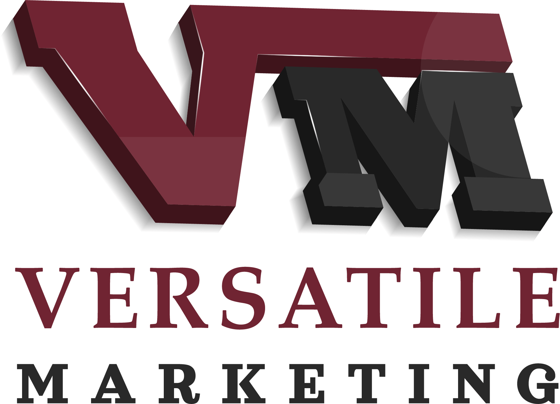
One of the most challenging — yet rewarding — logo projects I’ve worked on was for a marketing agency called Versatile Marketing. The client had a very clear vision and a perfectionist mindset, which made the creative process both demanding and exciting. He wanted a logo that stood out from the competition — something completely fresh and original — with a strong emphasis on incorporating the agency’s name and initials into the design. To meet his expectations, I began with thorough market research, exploring competitor logos, analyzing industry trends, and brainstorming unique visual concepts. We went through five rounds of revisions, as many of the initial designs didn’t fully align with his preferences. While it was a meticulous process, each round brought us closer to the right direction. After extensive testing and refining, I was able to develop a logo that truly captured his vision. It was incredibly fulfilling to see the final design come to life — and even more rewarding to know that the client was genuinely thrilled with the result.
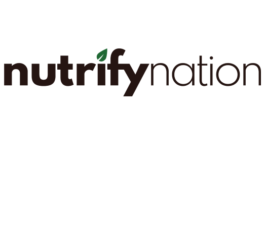
One of the most enjoyable logo design projects I’ve had the pleasure of working on was for Nutrifynation, a nutrition-focused e-commerce store. The client was excited about the branding process but unsure about the exact direction, so he requested a variety of logo concepts to explore different possibilities.To help him find the right fit, I created designs across seven different logo types — from icons and emblems to abstract marks and wordmarks. After reviewing the options together, we decided that a wordmark best captured the brand's identity.From there, I focused on refining the wordmark, collaborating closely with the client on color schemes and typography choices. After several thoughtful iterations, we landed on a clean and vibrant logo featuring a green leaf above the letter “i”. This small yet meaningful detail symbolizes nature, wellness, happiness, and the essence of living a healthy, joyful life — all values at the core of Nutrifynation’s mission.
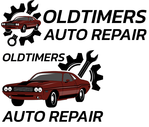
One of the most exciting projects I’ve had the opportunity to work on was designing a logo for Old Timers Auto-Repair Shop. As a car enthusiast — especially a fan of classic American muscle cars — this project was particularly close to my heart, and my enthusiasm definitely fueled the creative process. The client wanted a logo that had a distinctly old-school vibe, in line with his business and the vintage cars he specializes in repairing. I developed three tailored logo concepts that matched his vision, and he ended up selecting two of them. Initially, the client envisioned a logo featuring only traditional repair tools. However, I suggested incorporating an old-timer car illustration into the design to make the logo more dynamic, visually descriptive, and unique. This approach helped distinguish his shop from more general auto-repair businesses, highlighting his specialization in classic cars. He loved the idea, and we agreed that this direction made the brand more recognizable and memorable. In the end, he decided to use both chosen logo concepts — a decision that perfectly captured the spirit and identity of his shop.
One of the most challenging logo design projects I’ve worked on was for a band of young, passionate musicians who dreamed of becoming a recognizable name in their city. The client envisioned a logo that was both old-school and modern — a blend that would reflect their musical roots while also connecting with their youthful energy. I began by exploring different creative directions and developed three distinct logo concepts that I felt best represented their identity. After presenting the designs, we went through three rounds of revisions, fine-tuning the details based on the client’s feedback and preferences. In the end, I delivered all three finalized versions — and to my surprise, the client loved all of them! He decided to use the classic version as the primary logo, the neon version as a secondary visual for special occasions or digital content, and the third variation as a favicon. It was a great experience collaborating with such a passionate group, and I’m proud to have contributed to their journey toward building a strong, recognizable brand.
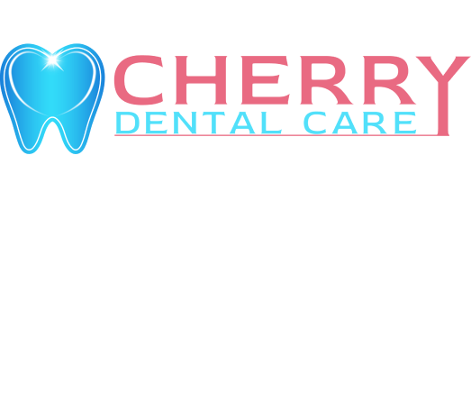
One of my favorite logo design projects was creating a brand identity for a young dentist based in the Cherry District, near Cherry Beach in Toronto, Canada. She envisioned a modern, polished logo with carefully selected colors — something distinctive that would set her apart from other dental practices in the area. From the beginning, she shared her ideas and preferences, while also welcoming my creative input. After a thoughtful brainstorming session, we reached a shared vision for the direction of the design. Throughout the process, we worked closely together, exploring a variety of styles and concepts. After multiple iterations and refinements, I presented three final logo concepts that captured the essence of her brand. The chosen design will be used not only as an illuminated sign for her private dental clinic, but also across her marketing materials, including brochures, business cards, and more. It was a true pleasure collaborating on this project, and I'm proud of the result we achieved together.
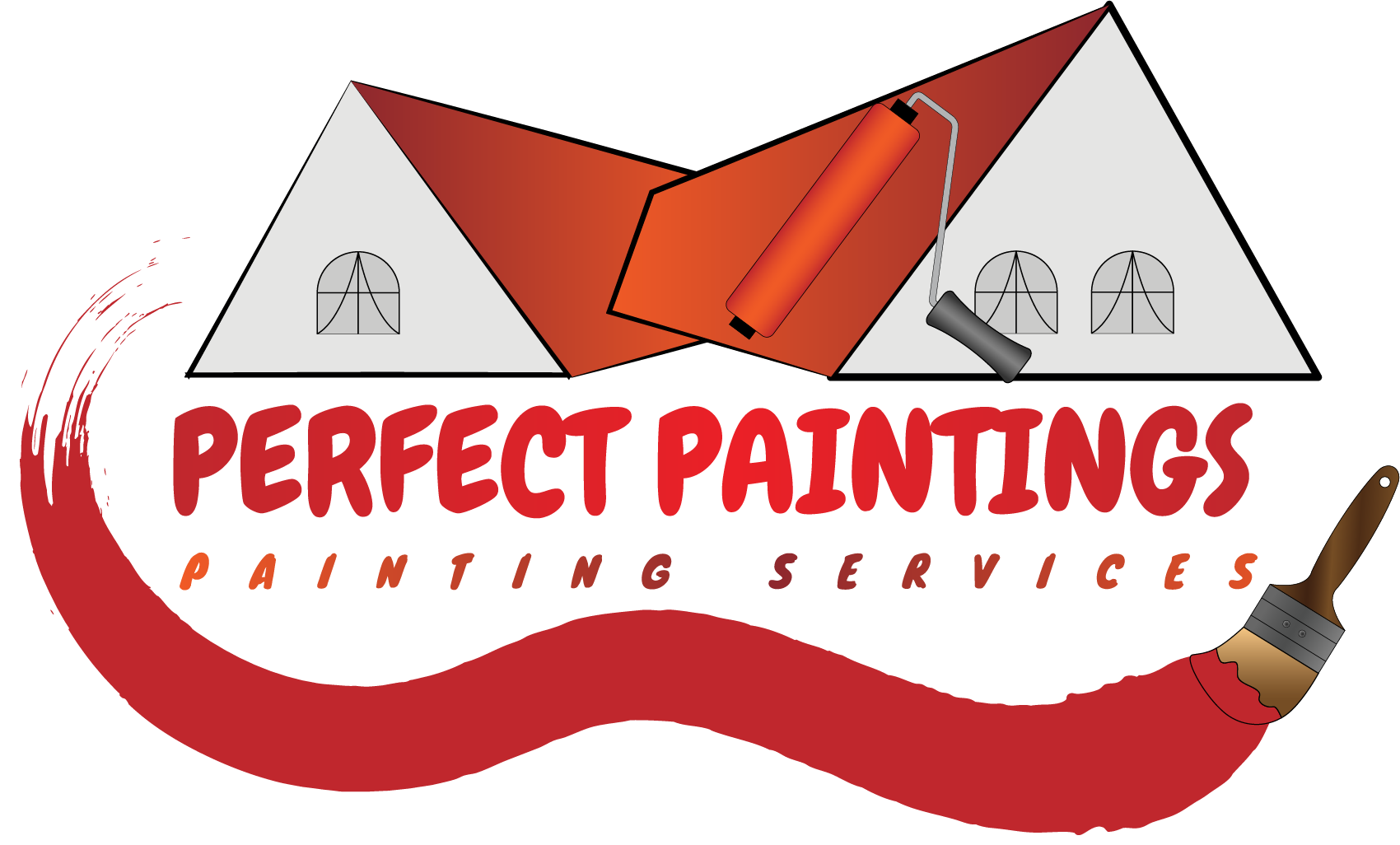
One of the most straightforward logo design projects I’ve worked on was for a painting services company called Perfect Paintings. This project was smooth and efficient, as the client came in with a clear vision and provided detailed guidance on what he liked and what he didn’t. I created three logo concepts with subtle variations to align with his preferences. He selected one as the foundation, and we continued refining it by adjusting color tones, fine-tuning the typography, and repositioning elements for better balance and clarity. In the end, I delivered the final logo concept that met his expectations perfectly — visually appealing, on-brand, and well-suited for his target audience.
One of the most interesting and most revision-intensive logo design projects I’ve worked on was for a client opening a bakery store. The project was both creative and demanding, as the initial concept the client had in mind evolved significantly throughout the process. The client revised his vision multiple times, making changes to key elements such as symbols, colors, and typography. To ensure we explored all possibilities, I developed around 10 unique logo concepts. After thoughtful consideration, he selected a design that featured a meaningful local landmark — the Statue of Napier, a symbol well recognized in his town. The final goal was to create a logo that was distinctive, versatile, and memorable, suitable for use across product packaging, labels, and illuminated signage for the bakery. Despite the many revisions, we successfully arrived at a logo that captured both the spirit of the brand and the local heritage — a result we were both proud of.
.png)